Hello vendors, hope you all had busy weekends
Today, I’d be writing about business cards. A business card is your/your company’s face for the client. It usually holds key details such as your name, title, what you do/what your business is about, company logo and contact details.
I know its 2015 and a lot of things happen online but I’ve found that business cards are still very relevant especially for the African market so its always best to have one ready just in case.
I once attended an event and there were so many exhibitors. I found so many people around a certain area – so I went over to find out what was going on. It was the area designated to caterers and of course, trust people, who no like free food. Anyway, I tried everything I thought looked interesting and found a particular caterer’s dishes very tasty, so I asked;
Me: Hi, can I please have your business card?
Caterer: We don’t have, we didn’t bring any, what is your full name?
Me: [confused] Excuse me?? What do you mean?
Caterer: We have a list, we’d write down your name.
Me: List of what
Caterer: List of everyone who asked for a business card.
Me: Oh I see, so what would happen
Caterer: We’d try and get in touch with you later
I left my details even though it didn’t really make sense but its been 2 years since and I haven’t received a text message, email, call from this caterer. This is not the way to go, my dear vendors. Its worth noting that at this same event, I met this other vendor who gave me a cut-out sheet of paper with all the details you’d usually have on a business card hand-written. Whilst this was not ideal, she made an effort.
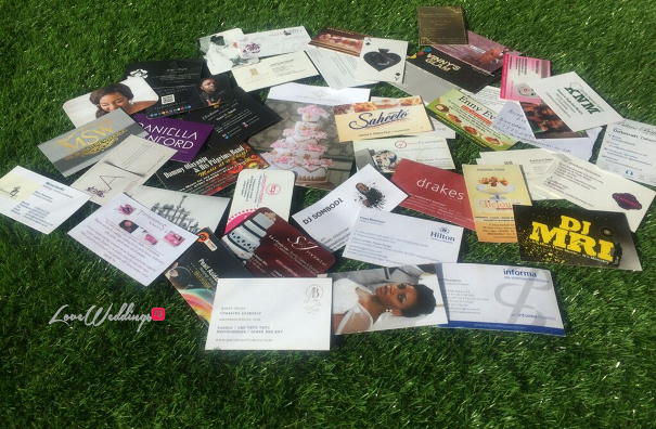
The moment I decided to write this post, I literally woke up and threw all the business cards I collected from a recent event on the floor and I decided to pick out some business cards that stood out so I’d be writing about three from the few that stood out. If you’re trying to (re)design a business card, some of these tips may help.
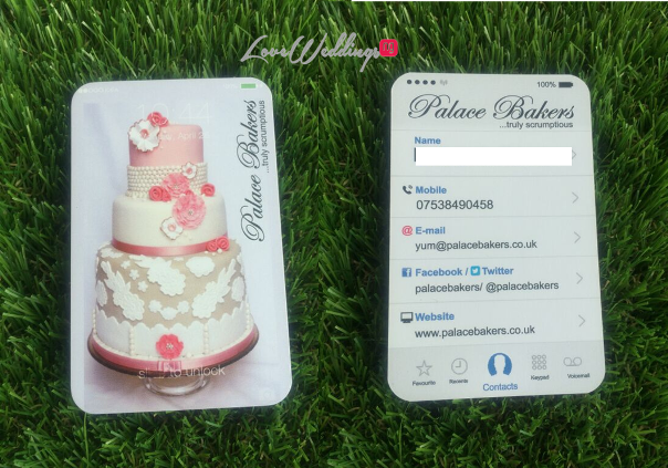
Palace Bakers’ iPhone themed business card stood out from for me because it actually looked like a phone. Perhaps because just like most people, I spend half my life staring at my phone so it caught my attention.

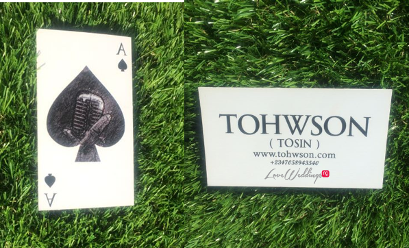
I picked wedding MC – Tohwson‘s business card because I remembered it. A lot of people hand me business cards but don’t really take the time to talk to me about it. But with Tosin, it was different, we had a ‘proper’ conversation about this card and that’s the beautiful thing about the mind, whether or not I choose to remember it, that conversation we had is stored somewhere in my brain.
I think its a good idea to have a business card that encourages you to build conversations with your clients. When he handed it to me at the African Bridal Wedding Vendors Networking event in July 2015, I remember saying ‘Interesting… Ace of Spades’ and then I looked at the middle, still wondering what the card was all about. He said ‘Look again’. Then it hit me ‘Oh, its a hand holding a microphone’… Very clever. As simple as this business card is, it works.
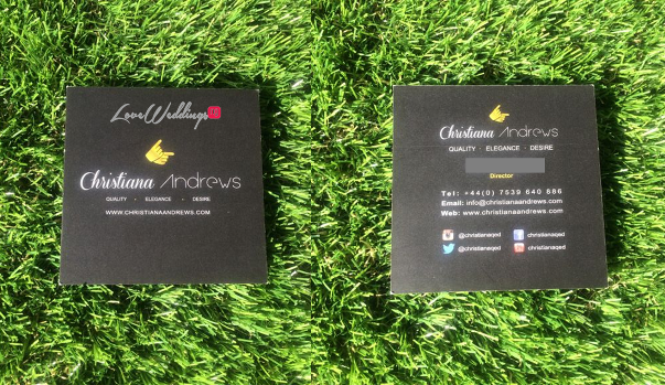
Christiana Andrews’ business card stood out because it was black. So many business cards are white so it’s very easy for your business card to get lost somewhere in between. Its worth noting that the chosen color is consistent with Christiana Andrews’ brand image so don’t just choose black for the sake of standing out if your brand color is purple or pink. The card is also uniquely shaped as a square unlike the usual rectangular shape of most business cards.
So these three cards were some of the business cards I picked out, there were others but as you know there’s only so much you can fit into one post and I would hate to bore you. Of all the business cards I picked out, most of them had the following common features;
- They all had two sides – one side had generic company details such as the company name, logo while the other side had specific details such as the card holder’s name, position within the organisation, contact details (phone number, email address, website, social media handles, etc)
- They were all consistent with the brand image. This is so important so customers can relate the business card back to your website, leaflet, Instagram page, etc.
- The text/copy on the business cards were legible i.e. I could read them without squinting. Some people use some kain fonts that only God understands. Use italics only where necessary and make sure they’re legible, space out text as much as possible and create a balance between images and text.
- They had contact details that were up-to-date. There’s nothing worse than giving out business cards with email addresses that you no longer use or incorrect telephone numbers. I have a story to share about this… I’d save it for another post.
We’d love to help you come up with a business card that not only stands out, but also serves its purpose – book a marketing consultation session with one of our marketing experts by sending a mail to info@loveweddingsng.com and we’d get back in touch with you.
Till the next post.
XX Seyi
For more LoveweddingsNG Vendor Tips, click HERE
Seyi
A true wedding enthusiast and founder of Loveweddingsng. I love everything that comes with being in love... Welcome to my world I'm always on the lookout for wedding ideas, inspiration, etc. Get in touch today via email at info@loveweddingsng,com


